Review

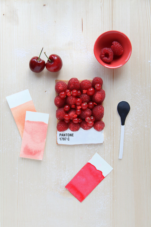
Sweet Pantone Tarts

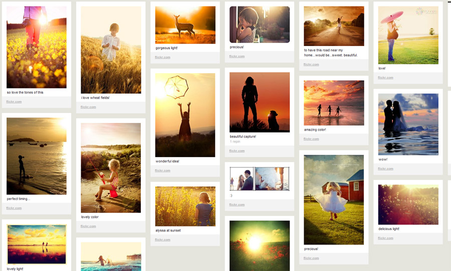
Spring seems to have sprung here in Pittsburgh, and having a week off on spring break makes everything seem lovely. It is under that guise I present this post to you purely for aesthetic reasons. Emilie Guelpa is a French artist/blogger/chef who has created these masterful (et très mignon) tarts inspired by Pantone colors. While I can totally imagine eating them in the café of an art museum, they were created for the magazine Fricote and posted on her blog Griottes. While the blog is currently French only, Guelpa promises an English translation version very soon. In the mean time, you can check out her Pinterest and dream about delightfully colorful tarts.

Well, that’s all I’ve got. I hope you have a great weekend planned and nice weather to enjoy it!


The Cloud

Moving your organization's data to a cloud server might be a good idea at this time.  There are several advantages to working off of a cloud server and a few drawbacks. Some advantages to going to cloud computing:

Accessibility is generally improved through cloud storage.  You can access data from anywhere that you have internet access.

Security on cloud storage services is up to the standard of where ever you have your cloud.  Google and Amazon have some of the best experts on digital security in the world for instance and using a cloud operated by them gives you a greater degree of safety for your data.

The Capacity of cloud storage is very flexible and is expandable with comparative ease.  The fact that cloud storage servers will never need to be upgraded or replaced does save you capital expenses as well as man hours.

The downside:

You don't own it and you have to play by someone else's rules.  If you are using a smaller company, please, make sure to check out their backup plans, security measures, and records regarding downtime and maintenance schedules.

It may be hard to use cloud servers with certain types of databases or other programs and as such may present an integration issue (ticketing systems, development programs, etc).  Make sure you have a plan to get the information from point A to point B if necessary.

In event that you don't have access to the internet you are completely cut off unless you back up to a physical source onsite.  It can be distressing for obvious reasons if your internet service goes sideways and you end up with multiple idle employees until it is restored.


Pinterest 101 for Arts Organizations [mini-nar]

Pinterest is the latest and greatest in social media, we've talked about it before, and it just reached 10 million unique hits in a month, the fastest independent website to ever attain this lofty title. Every blogger with access to a data set out there is looking at the demographics of Pinterest, but what can a visually based social media do for your organization? This Mini-Nar is going to take a look at some of the basic functions of Pinterest, as well as how some arts organizations are maintaining and utilizing their Pinterest accounts. http://youtu.be/JZKgsWlU6Uk

Check out these Pinterests from the video: the San Francisco Museum of Modern Art, the San Francisco Ballet, the Arts and Business Council of Greater Philadelphia, and Lionsgate Be Fit. Some of the demographic data I referred to came from Tech Crunch.

What do you think? Is Pinterest something you'll consider using - or do you already utilize it? Comment on this post and let us know!

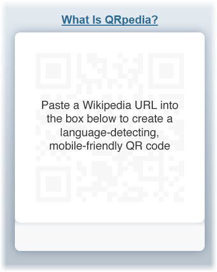
The Best of Both Worlds: QRpedia.

While scanning a quick response (QR) code on the back of a cereal box only to find it directs you to the cereal’s web site is, how can I put this politely, fun (that’s my attempt at sarcasm), it neither reflects the appropriate usage nor does it maximize the potential of those nifty little black and white squares. There's the cereal box QR code, and then there's QRpedia. QRpedia is a program announced by the Wikimedia Foundation in September 2011. It is currently competing in Barcelona at the Mobile World Congress for the title of the United Kingdom’s “most innovative mobile company.” Today, on February 29th, the winner of the award will be announced. The reward? The United Kingdom Trade and Investment’s (UKTI) support to expand the company internationally.

But enough about the competition. What exactly is QRpedia and how does it work in the museum setting? It functions just as an ordinary QR code does, except for its whole language-detecting brilliance. A Polish speaking viewer walks up to, let’s say, Claude Lorrain’s Seaport at Sunset (1639) hanging in the Louvre in Paris. In front of the text panel, the visitor whips out his/her smartphone and snaps a photo of the QRpedia code. The QRpedia code instantly detects the phone’s language and the browser opens to a Wikipedia article on the painting or related topic in that written language. If an article on Claude Lorrain’s Seaport at Sunset isn’t available in Polish, the QRpedia code will direct the user to the next most closely related topic available in that language, perhaps an article on the French, 17th-century landscape painter, Nicolas Poussin.

QRpedia’s language-detecting technology makes it truly unique. For foreign visitors, this eliminates the expense of an audio guide from museum visits (if there is a guide even available in their preferred language) and replaces it with the ease of snapping a photo, the interactivity of a QR code and the straight-forward, mobile-formatted information of a Wikipedia article.

[embed]http://www.youtube.com/watch?feature=player_embedded&v=aXCUOpBytxA [/embed]

Terence Eden, the lead developer of QRpedia, says

QRpedia is the perfect way to get access to massive amounts of cultural information. A typical museum display has less than a paragraph of text, often just in one language – QRpedia can give encyclopedic information in hundreds of languages. Recently, in Derby Museum, a painting by Joseph Wright was taken away for cleaning. The Museum staff have put a QRpedia code in its place so that visitors can still see a high quality image of the painting, and read information about the painting and its creator.

The program was created at the Derby Museum and Gallery in England. Today it is available online for any and every museum, gallery, library, public park, archive, historic landmark and so on. QRpedia has been implemented at numerous prestigious museums and galleries worldwide, including the United Kingdom’s National Archives and Spain’s Fundació Joan Miró. How about the United States, you ask? Why yes! It has been implemented at the Children’s Museum of Indianapolis. But why stop there? Its usage is not limited to arts and cultural institutions. Fun fact- the Occupy movement uses QRpedia codes on its posters and publications to disperse information to a wide and diverse audience.

What’s in it for the museum? A lot, actually.

1) You can create your own, online, as often and as many as you want.

2) For museums with multilingual audiences, a text panel can become cluttered and overwhelming with various translations. Additionally, the space allotted to provide relevant information becomes increasingly limited with numerous translations, causing you to cut-back even further on relevant information.

3) Because Wikipedia is editable, a curator, exhibition director, museum official or artist can translate articles to various languages and create articles if there is a void. That being said, so can anyone else. But be brave. Be bold. Be confident in the power of the public intellectual collective.

4) According to Roger Bamkin, the co-creator of QRpedia and the chair of Wikimedia UK, “We see e-volunteers giving thousands of hours to support museums... Hundreds of new articles have been created in dozens of different languages.” Beyond printing the codes, I’d say the work is done almost entirely for you.

5) QRpedia codes are not limited to paintings and items in your collection. Incorporate them in museum signage, directionals, cafe menus, etc.

6) QRpedia also records usage analytics. Museums, galleries, whoever, can track the number of QRpedia users, the paintings with the most QR code action, the most common languages, etc. In my humble opinion, it offers a rather innovative way to get to know your audience.

Accessible, innovative, interactive (for those inside the museum and those elsewhere translating Wikipedia articles without any intent to ever visit the museum…), and FREE. For museums and cultural institutions looking to expand into the QR code realm, this is the place to start. The Wikipedia articles are already written, online, and translated. Why not offer your visitors a more complete museum experience in their preferred language?

A Look at Typography: Google Web Fonts and More!

This terrific, typographic Thursday, let’s take a flourishing swoop through the world of serifs, ligatures, and stems. If your knowledge of type is limited to Times New Roman, Arial, and the omnipresent Helevetica, its time you enlarged your typographical horizon. For no amount of bolding, italicizing, and underlining can emphasize the importance of using appropriate and engaging typefaces.

Recently, the Metropolitan Museum of Art won the “Best in Class” award from Interactivity Media for its new website. While the Met had a lot of help from Cogapp, a company specializing in digital media technologies, there are number of cost-effective ways to improve the visual appeal of your own site; typography being one of the oldest and most aesthetically attuned.

A little over a century ago, the glistening era of the Parisian Belle Époque was beautifully, and textually illustrated in the posters by Henri de Toulouse-Lautrec. During World War I, Dadaists employed unconventional typography in their manifestos to signal an era of violence that could no longer conform to the bourgeoisie proprieties of the past. Even our love for vintage posters from the earlier half of the twentieth century has a lot to do with the brilliant use of typography!

But somewhere along the line, we became rather stiff in our typographical efforts. Concerns with readability lead to an irrational fear of the serif, and the world forgot that it had come this far, using typefaces besides Arial or Helvetica. While it is true that some of the older typefaces lose their readability when viewed online, there are many, many typefaces that have been created since the advent of the web. These newer font families are easy on the eyes, in both readability and visual flamboyance. Forget Comic Sans, it’s time for Fonts Sans Boredom.

One of the best places to start searching for the perfect typeface is in the neat world of Google Web Fonts. "Google Web Fonts makes web fonts quick and easy to use for everyone, including professional designers and developers. We believe that there should not be any barriers to making great websites. Our goals are to create a directory of core web fonts for the world and to provide an API service so that anyone can bring quality typography to their webpages."

The fonts provided by Google are open source, which means they are free and can be used sans fear! Each font is accompanied by a short paragraph describing its origins and the best uses (titles, sub -headings, paragraph text) for that particular style. You may be interested in an article in Mashable that gives you step by step instructions on How to Implement Google Font API On Your Website.

 Another great resource for the art of the alphabet is the website I Love Typography. The site features lots of informative articles by John Boardley, the publisher of Codex, the journal for typography. If you happen to desire a more typographical world, the website is great way to learn about different typefaces and their appropriate usage. As Boardley writes, “It’s just about impossible to imagine a world without type, but at the same time type’s ubiquity has most of us taking it for granted. So take a closer look.”

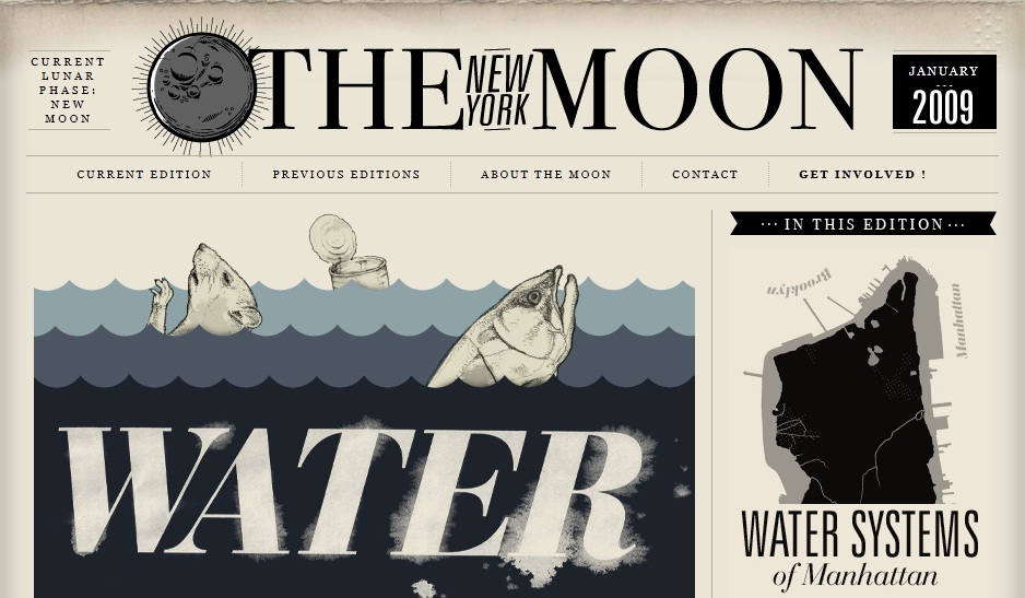
If you do take a closer and more critical look, you will soon notice how some sites employ typefaces to their advantage. I Love Typography is, of course, an undoubtedly great example! Others include The New Yorker, which uses beautiful text and plenty of white space to lessen the clutter and increase its visual appeal. Typographica and The New York Moon (showcased above) are other great examples of websites that transform text into graphic design! An entire list of sites showcasing the marvels of typography can be found in an article by the Design Cubicle.

So let terrific typography embolden you! Let's use it to eliminate textual overload and alphabetical lackluster.

Leading with Social Design at Facebook’s Analog Research Lab

“Everything just is,” says Christopher Cox, Vice President of Product at Facebook. Photos is an application for photos, Events is for events, and Groups is for groups of people. Though many criticize Facebook’s interface and design as bland and uncreative, its designers at the Analog Research Lab test their ideas and design decisions in a highly informed way.  According to a design mind article by Reena Jana, the Analog Research Lab is the company’s creative design space used to

...create branded marketing materials—T-shirts, for instance—for developer conferences and other Facebook events. It’s also where designers experiment with simple fonts and sleek iconography that will eventually influence what appears on the Facebook website.

I had never heard of Facebook’s Analog Research Lab. But its purpose, products and success reminded me of topics I have discussed in previous posts. For example, consider Facebook’s design decisions in light of  Nina Simon’s The Participatory Museum. Facebook has certainly managed to promote a social experience that is accessible, meaningful and unique to each user, in large part due to the structure format and design elements the creative team at the Analog Research Lab develops.

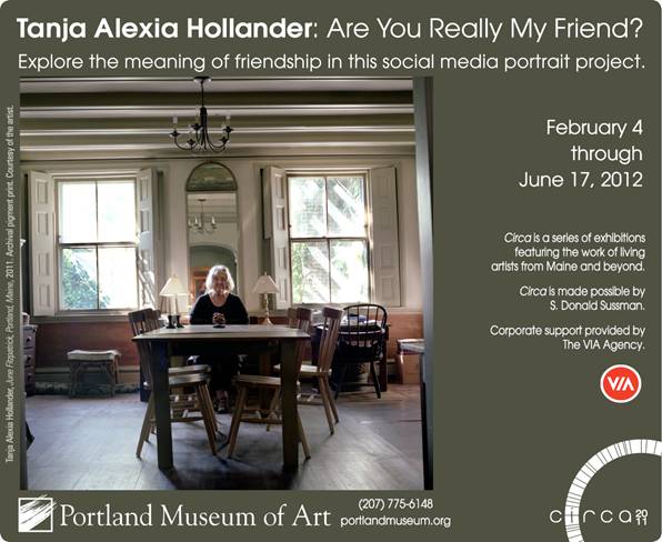
Or consider artist Tanja Hollander’s most recent project, Are You Really My Friend? The Facebook Portrait Project,  exploring the (d)evolution of human relationships as a result of our simultaneous existence in two worlds- the virtual and the real. At the Lab, designers are on a mission to make virtual interactions between individuals less cyber and more real.

The Analog Research Lab is not staffed with full-time employees. Instead, it serves as a space for Facebook designers to express the company and the brand using tools and techniques that are, get this, non-digital. The lab is stocked with a printing press, wood cutting tools, ink, a dark room for developing photos, drying space, etc. It encourages designers to focus purely on design, design techniques, and simpler, less complicated design strategies. True to its name, the Analog Research Lab is also a design research space. Colors, fonts, styles, shapes, etc. are tested on real people to gauge their future success and popularity online. The designers also use the space to make motivational, quirky screenprinted posters. Lots of them. So. Cool.

The Lab also serves as the home of Facebook’s new Artist-in-Residency program, a project to create, support and install offline artwork in Facebook’s offices. The first artist, Jet Martinez, recently completed a large, colorful mural titled “Bouquet” to beautify the walls of Building 17, where the company’s engineers work their magic.

Facebook’s offline and online design decisions aim to support human-to human interactions. This may come as a surprise, especially in light of the charged sociological and anthropological discussions that social media has forever affected (for the worse) humans’ ability to interact, engage and relate to one another in the physical world. Facebook’s creative leadership, including Cox, Ben Barry and Everett Katigbak, are committed to the design approach of “social design.” Updates to Facebook’s features, product development and design are made in response to users and their online behavior. Jana explains this approach as one that

…improves how people build human-to-human, versus human-to-interface, connections online.

Take for example one of the Lab’s stationary products- postcards printed with the word “Poke” in red letters. The design is in obvious reference to the virtual action of “poking” a friend on Facebook. To support the human-to-human connection, designers in the Lab created printed postcards, with non-digital design tools, for Facebook employees to write hand-written messages to send through good old fashioned, snail mail. The creative work done in the Lab explores the overlap and divide between cyber and physical interactions- translating Facebook's interactiveness in the digital realm to a tangible reality in our inhabitable space.

It is a neat space- the perfect dichotomy of trendy, vintage workshop and hip, old-school office. I am always curious to see how technology companies incorporate offline art and celebrate non-digital artists in their physical space, if they even do so. Are there other technology companies with similar artistic, in-house projects like Facebook's Artists-in-Residency program? Do technology or digital design companies have a responsibility to support non-digital and offline art? Are cyber users more attracted to online interfaces with simpler, non-digital design elements? Take a look at your own Facebook page. Think about the scaffolding, constraints and structured components that ironically, like Simon suggests, make self-expression so much easier and fluid.

Expanding the Dialogue with the CultureCode Initiative

While the intersection of technology and the arts has always presented a series of exciting opportunities for us here at Technology in the Arts, the reality is many cultural and arts organizations find technology challenging. It can seem especially prohibitive to small organizations and individual artists who may lack expertise. The Arts Council England and Codeworks have developed an interesting forum to increase the dialogue between arts organizations and the developers of this intimidating technology, the CultureCode Initiative.

No definition fits the CultureCode Initiative better than the one straight out of their digital press release,

“The CultureCode Initiative is a series of free events designed to open up new opportunities for highly skilled developers, designers and assorted geeks to work collaboratively with cultural organisations and artists.”

Here’s why I find the idea of the CultureCode Initiative so fascinating: technology often overwhelms people and appears antithetical to cultural organizations that feel that new technology can make them obsolete. The CultureCode Initiative seeks to completely debunk that myth, as Tyneside Cinema Chief Executive Mark Dobson explains, “You don’t need to have any previous experience of digital to attend this event”.

The CultureCode Initiative’s website even states “you don’t need an IT department” to partake and learn from their events, and some are guaranteed to be "jargon-free". The advent of web 2.0 and the current culture of sharing absolutely everything via the internet has democratized information. The CultureCode Initiative, to me, is increasing accessibility and informing arts and cultural organizations know that it is possible and it is easy for them to join this discussion.

Most importantly, perhaps, the discussion is not meant to be in one direction. While most similar opportunities are aimed at instructing arts organizations in utilizing technology, the CultureCode Initiative encourages two-way dialogues, with events showing developers how they can take a new look at cultural organizations and how cultural organizations can reconsider their “digital assets”.

If you’d like to join the discussion live, their first events start early next week (Tuesday, February 21st ) and CultureCode ends with a huge twenty-four hour Hack towards the end of March.

If you don’t happen to live in the North East of England (where these events take place) you can join the discussion digitally by tweeting @Culture_Code.

Any of our readers going? Be sure to let us know your perceptions of the events – you can bet Tech in the Arts will be watching to see what cool solutions come out of the CultureCode Hack.

The Participatory Museum: A Must-Read Book for Current and Future Arts Managers

Traveling this weekend, I decided to put aside my school work, leave my laptop at home and finally read Nina Simon’s, The Participatory Museum. As an arts management student, I cannot emphasize enough just how relevant this book is for cultural institution administrators, especially future ones. I have decided procrastinating over the weekend was in the name of the future of museums (at least that’s what I’m telling myself…).
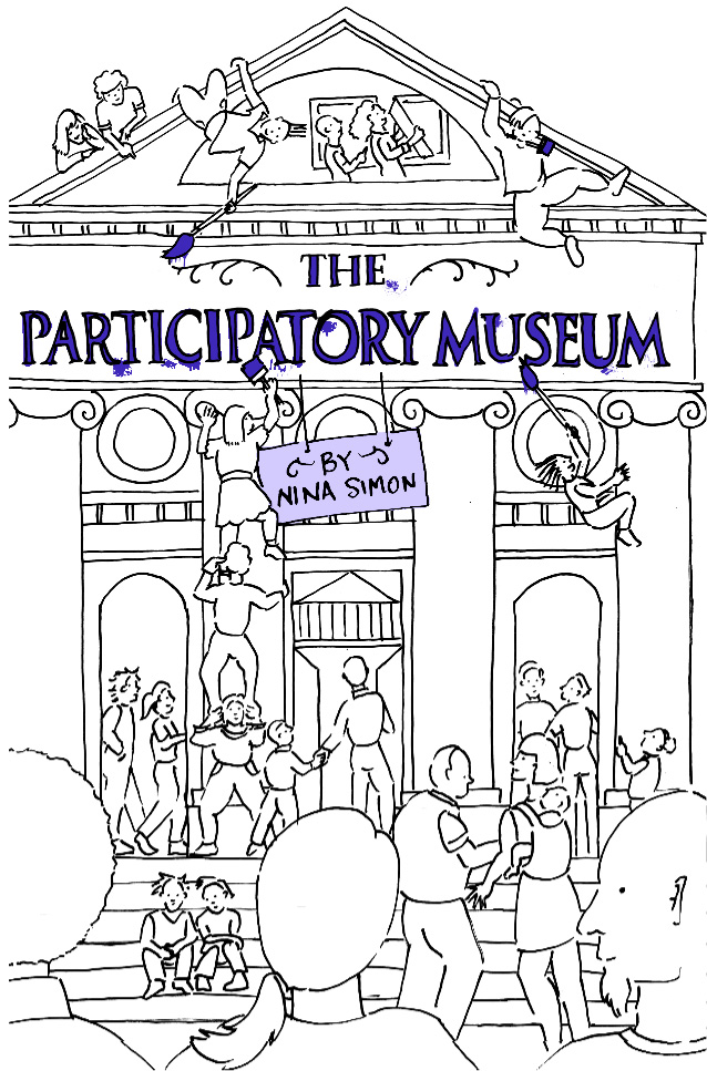
Nina Simon, the author of the book and Museum 2.0 blog, is the Executive Director of the Museum of Art & History in Santa Cruz. Simon shares her own experiences of visiting, working and participating (or not) in museums throughout the book. What I find most critical to the book’s success in discussing participation in the museum setting, and doing so credibly, are the countless examples and case studies ranging from science museums to art museums, and Simon’s personal, professional accounts to events she observed and experienced. The case studies are relevant, contemporary, and thematically and geographically diverse.

The purpose of this post is not to offer a summary of the book, though if it were, I would say this: it is an introduction, resource and guide for cultural institutions on where/when/why/how to engage visitors as “cultural participants, not passive consumers.”

Instead, I will focus on three components of visitor participation and engagement: the different types of participants, the need for constraints and the four models of participation.

Until this weekend, I was under the impression there are two types of museum goers: those who will sit down at a computer screen to video record their reaction to an exhibition as prompted, and those, like myself, who will not. I don’t think I’m alone in that fallacy either. If video-recording or commenting on my experience is the extent of the museum’s participatory program, well then, I’m out of luck. Simon applies research conducted by Forrestor Research to explain the participatory trends and types of audiences in the cultural institution setting. These audiences are:

1.The creators

2.The critics

3. The collectors

4. The joiners

5. The spectators

6.The inactives

Think about YouTube and Flickr. These social media sites encourage participation from all types of audiences, including those who want to post content, share videos and upload photos (the creators); those who want to publicly like, dislike and rate content (the critics); those who like to aggregate the videos and photos they most enjoy in their own profiles (the collectors); those who are members or have an account on social network sites (the joiners); those who consume the videos, photos and blog posts of those who create them (the spectators); and finally, those who have no interaction with online social sites (the inactives).

Ah ha! So those of us who don’t feel comfortable sharing at the video commenting station aren’t lazy museum participants! Rather, the museum has neglected to incorporate a means of participation that engages our type of audience. It is often the case that cultural institutions engage either the creators of user generated content, or the spectators, polarizing the museum audience into those two groups.

Knowing there are critics, collectors, joiners and the inevitable inactives who have what Simon calls, “intermediate participatory behaviors,” a museum must create participatory experiences to discourage participation inequality and to encourage engagement.

Participation inequality leads me to my next point. To encourage participation from all audience types, exhibits must be designed with limitations, constraints and scaffolding. This may seem counter-intuitive if you want open, unrestricted and expressive responses from your audience. However, open-ended questions and activities cause many visitors to run away in fear and self-consciousness. My most favorite art-related quote (by Oscar Welles) so brilliantly addresses this barrier to participation, productivity and creativity: “the enemy of art is the absence of limitation.”

Simon writes

The best participatory experiences are not wide open. They are scaffolded to help people feel comfortable engaging in the activity. There are many ways to scaffold experiences without prescribing the result…A supportive starting point can help people participate confidently – whether as creators, critics, collectors, joiners, or spectators.

Scaffolding and constraints make participating less daunting and audiences feel more confident in themselves and their ideas. Simon provides examples and case studies of successful, constrained projects and activities that engage all types by limiting self-expression and open-ended opportunities. This is brilliant. Is it a completely new idea? No. But Simon provides all the information you need to create quality outcomes for all. She explores what limitations in the cultural institution setting are, how they work, why they work, who they benefit, and how you can implement them in your organization.

Now that we understand the diverse needs and types within the audience and how to scaffold the creative experience, we can now take a look at Simon’s four different models for participation:

1. Contributory

2. Collaborative

3. Co-creative

4. Hosted

The second half of Simon’s text focuses on each model of participation. You can access a handy PDF version of Simon’s matrix that organizes each model according to the organization’s commitment to community engagement, need for control in the participatory process, vision of relationship with the participants, goals for the participants and nonparticipants, etc.
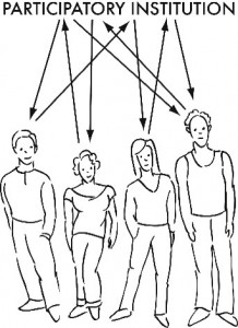
Depending on the organization’s mission, capacity and the situation, different models of participation will be more effective than others. The most critical factor to determine when deciding what model of participation to employ is the extent of control the organization wants over the process and its participants. Once the question of control has been addressed, museums can then determine their vision and desired outcomes for the project, the type of participation activities required to reach those goals and the role of museum staff. The final task  is to measure the success and impact of the participatory project.

I recommend this book to current students and professionals in the museum field. As we enter an age of an increasingly diverse society, it will become even more critical for museums to create opportunities that encourage all audiences to attend, engage and participate.

The Participatory Museum is available in three formats: as a paperback book ($25), a downloadable file ($18), and online (free). I encourage our Technology in the Arts followers to read the book, or simply a chapter of it, and contextualize the material in terms of your own arts organization- be it a museum, community center, arts center or gallery. How do you currently encourage visitor participation? Are you engaging all types of participants? If not, what types of programs, projects or exhibits can your organization support to better engage more visitors?

For further information, check out this previous Technology in the Arts post on a talk given by Simon at the Pittsburgh Children's Museum.
Mobile Fundraising Applications: The Apple policy over one year later

Apple banned fundraising apps for the iPhone, iPad, and iPod over a year ago (to much controversy) just as the first fundraising app hit the market through eBay/MissionFish.  The field of software for fundraising as a result of the ban is anemic. Until this policy is removed it seems unlikely that major fundraising will take place via mobile applications.  As the iPhone is the number one smart phone on the market developers have much less incentive to build software for fundraising purposes.  It can be extrapolated that once the ban is lifted the fund-raising/development world will be playing catch-up for years.

Here are two notable successes/efforts to do fundraising through mobile apps over the last year:

eBay and Missionfish are on the verge of offering donation capabilities through eBay's mobile application for Android (it was originally intended for the iPhone).  These donations should be relatively easy to put through and involves the user downloading the mobile eBay application and then searching for your cause.  On the organization's end the donation item has to be set up as well as the account which will interface with paypal.

In the UK a group called Marie Curie Cancer Care managed to get around the ban by setting up an app that allows users to request donations from friends through text messaging.  The application itself doesn't collect the funds but is party to gathering them.

If you want to take action, you can sign the current petition to overturn the ban here.


Art Meets Tech (and Science!) in London

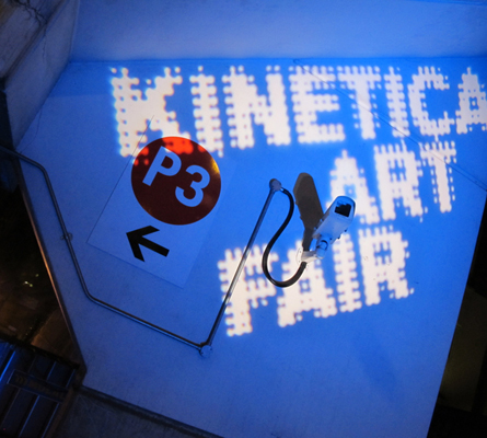
Allow me, for a moment, to add an exhibit to Naina’s post last week about the “Exhibits on our Wish List” here at Tech in the Arts. This one, however, is a little different. Combining stunning artwork with the latest in technological trends, the focus here is on art from a wide variety of interesting fields: artists who focus on kinetic, robotic, electronic, sound, light time-based and multi-disciplinary new media art and technology. Now in its fourth year, the Kinetica Art Fair, produced by the Kinetica Museum in London, held its 2012 fair this past weekend across the pond, bringing together artists, visitors and exhibitors from around the world in a 5-day event. In addition to the art show, the fair also held presentations, live performances, screenings, panels and an awards show. With over 50 exhibitors in place and over 300 works of art, if it sounds like the world’s coolest and nerdiest art show, it just might be.

The theme of this year’s show helps solidify that opinion: titled “Time, Transformation and Energy,” the show will focus on what the organizers call “the shifting of time in the light of cosmological, astronomical, environmental and evolving universal events.” The feature exhibition of the show, centered on this theme, brings together 18 artists from eight countries, which use and display pulsating sound performances, incredible light shows, kinetic energy showcases, and, perhaps best of all, it includes robots.

What’s unique about the show from my perspective is how it uses time and the evolution of technology to advance new styles of art and expression. The founders of the event, Dianne Harris and Tony Langford, recently gave an interview to the Huffington Post where they talked about what makes the show so unique:

“Kinetica ultimately focuses on a current new trend in art that has a strong historical lineage dating back to the '50s. The work essentially makes suggestions and contributions towards human evolution and reaction to scientific and universal exploration. With the ever-increasing scientific and technological advancements in our culture, many contemporary artists have crossed the threshold from 'fine art disciplines' into new media, with artworks that utilize technology to explore, nurture and comment on our evolutionary processes.”

Another interesting facet of the show is how strongly science is interwoven into its DNA. With exhibits and presentations such as “Contemporary Conditions of Temporality in Kinetic Art” and “Architecture, Digital Media and the Kinesthetic Idea,” the show seeks to provide a scientific and theoretical background to some of the artwork on display.

Even the field of astronomy is a part of the fair as well: artist Paul Malone headlines the “Electric Universe” exhibit where he examines the role electro-dynamics play in the forming of objects that make up the world of astronomy, where visitors can hear about the history of the study of electricity.

Not to be outdone, the historical nature of the program is what appeals to me most. Who wouldn’t want to attend a presentation titled, “From Copernicus to Polish Dragons – From Physics to Poetry of Transformations”?

There are some fascinating works of art at the show as well, although none of them involve polish dragons. One of the most unique is called the Xylophone Wheel by artist Alexander Berchert, which takes the plastic clackers from bicycles and molds them together to create a musical instrument: xylophone plates are attached to the wheel and plastic beads bounce off of them, producing a distinct chime sound.

Another unique work of art, and perhaps my favorite, truly incorporates the world of social media: @TweetLamps, by artist Jordan Burnett, contains a set of light bulbs that are controlled by tweets sent through Twitter, where the lights go off when certain pre-programmed words of hashtags are tweeted.

With the 2012 fair ending yesterday (sadly), we’re a year away from the next show. For a taste of the kind of unique art you can see at the exhibit, here’s a compilation of art from their 2011 show last year:

Kinetica Art Fair 2011 from Kinetica Museum on Vimeo.

So while the 2012 show just ended, judging by pasty year’s fairs, next year’s show should be just as exciting. Anybody up for a trip to London?