


Chrome Music Lab is a fun, easy to navigate, tool which can help music educators engage children and music novices alike.
Learning Made Easy with Painting Portal for iPad
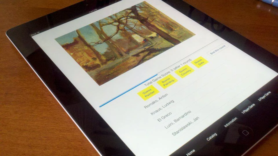
Whether you're someone who just loves to learn or an undergrad trying to absorb all the art history knowledge of all time - have I got a treat for you. I took some time to check out Painting Portal - a helpful compendium of paintings from the iTunes app store.
How Google Art Project Benefits the Public

How many of you have ever imagined being able to see artwork in the greatest museums around the world without leaving your chair? Driven by his passion for art, Amit Sood developed Art Project to let people do just that. The Google Art Project includes various museums from nine different countries, which provides people an access to artworks worldwide. It’s not uncommon, many people and organizations began to think about “online museums” years ago. However, I found two important features, which I rarely notice on other similar websites, that differentiate Google Art Project from others-----the extremely high pixels (10 billion) and the collection button.

image 1
(Image 1)
Some people wondering what could we get from 10 billion pixels? Google Art Project’s pursuit for an extremely high pixel count for each piece ensures audiences have a high level of exploration experience for artworks. For instance, the Harvesters, painted by Pieter Bruegel the Elder in 1565, gives you a general view on the artwork at the first glance (Image 1). Gradually, you will probably be curious about several detailed part of the paintings. What are people doing in the triangle 1 and triangle 2 areas (Image 1)? As you zoom in triangle 1 area, you will clearly see expressions on each person’s face (Image 2). Then you will really want to look deeply. As you start playing around, you will find something going on over there in triangle 2 area. As you zoom into the triangle 2 area, you will find that the artist depicted a scene of kids beating something (Image 3). Apparently, it seems to be a quite popular game. After I did a little research on Google, I found this was a game called score which involves in beating the goose with sticks. You see, I learned something from the exploration process for the painting.

image 2
(Image 2)

image3
(Image 3)
This high standard of pixels also enables people to observe the details about brush strokes and to see how an artist actually creates the masterpiece. As I deeply go to the favorite part of the painting Starry Night painted by Van Gogh. Interestingly, as I zoomed in, the cracks noticed seemly closer the distance between Van Gogh and me. I've never gone into the Starry Night like this before.
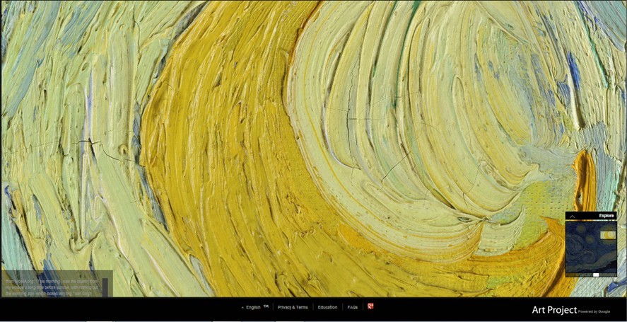
image5
Another amazing feature of this project is the collection button. This button enables any one of us to create our own museums online by creating our own collections out of all these images. Moreover, you can introduce your museum to your friends via sending an email and really get a conversation about what your feeling is when going to these masterpieces.
Additionally, we also see some potential values of this project for the arts education field. This could be a great tool for arts teachers to better get to the interpretations of interesting details of the masterpiece in class. For now, the Google Art Project seemingly performs well at a technical level. However, from a management perspective, some people doubt its problematic execution. Another concern is if the implication of Google Art Project is that in the future there will no longer be any need to visit a museum. This is not our focus of this post, but we are curious about your opinion about this project. Leave a comment below!
SFMOMA Families App Drives Away Gallery Fatigue
“When I’m walking around an art gallery, rooms full of paintings, after 15 or 20 minutes, I really am not thinking about the painting, I’m not connecting to them. Instead, I’m thinking about a cup of coffee that I desperately need to wake me up. I believe somebody put the painting on the wall because they think it is good enough to be there. But I don’t see it. I feel unhappy and guilt about my stupidity.” Said Tracy Chevalierin her TED speech about “Finding the story inside the painting” How many of you also suffer from gallery fatigue?
Cool Tech Resources for Learning - Codecademy, Pen.io, and Duolingo!
It’s safe to say that today, proficiency can be acquired in two very different kinds of languages; those used by people, and those by people that create, innovate, and run technology. So some have mastered Italian, Russian, and French. Others, JavaScript, C++, and Python. But that leaves a third category still. One that switches from Italian to C++ to German with panache! If you aspire to be in this last dexterously linguistic category, there are resources you can use to develop your technical and literary skills! And we chose to highlight only the best:
MOMA's Art Lab App: Play with the Sounds and Shapes of Art!
The sublime James McNeill Whistler once said, “Nature contains the elements, in colour and form, of all pictures, as the keyboard contains the notes of all music. But the artist is born to pick, and choose, and group with science, these elements, that the result may be beautiful--as the musician gathers his notes, and forms his chords, until he bring forth from chaos glorious harmony.” In the years since, the relationship between art and music has progressed from a silent harmony to a colorful crescendo.
Review of Tate Modern's new app
The Tate Modern recently launched a new app: Magic Tate Ball. The app is free in the same vein as RaceVSTime was (an app that Tate Modern released last January). Here is a review after a few days of trying it out on an iPad (first edition).
Some background:
Magic Tate Ball is a new location-based mobile app from Tate, inspired by the iconic Magic 8 Ball, where players shake the ball in search of an answer to one of life’s mysteries.
Book Review: Don't Make Me Think!
If anyone out there is planning a major overhaul of their Web site, listen up. I've just finished reading Don't Make Me Think: A Common Sense Approach to Web Usability, by Steve Krug. This book is a great guide for anyone who wants to get some insight into Web style conventions, how visitors use Web sites, and usability testing. Why are conventions and usability important? Imagine picking up a newspaper with no headlines, no sections, no page numbers. Web conventions are important to know because, well, people have come to expect them. And, they work.
The book is a quick read (about three hours) and user friendly (it would be self-defeating if it were otherwise). The tips and advice offered by Krug are great pieces of wisdom to have in the back of your mind as you examine the needs of your site's users, work with designers, and seek buy-in from stakeholders.
The second edition of the book was published back in 2005, but the trends and conventions it cites are not out-of-date by any means. And, the backbone concept of "don't make me think" is timeless. This book is definitely worth checking out, especially if you're about to put any time, effort, and money into revamping your organization's Web presence.
Related site: Advanced Common Sense (Steve Krug's site)