This is part 1 of a two-part series.
As sites of learning and inquiry, museums aim to engage a variety of audiences within both the physical museum space and across digital platforms. With the increased access afforded by digitized collections and social media, museums are being faced with the challenge of meeting greater audience demand for interactive, personalized experiences that differentiate the museum visit and increase engagement with the institution and its collection.
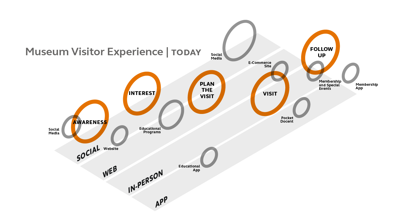
A diagram of a museum visitor’s journey. Source: https://www.bdcnetwork.com/blog/future-museums-ultimate-visitor-experience
In response to this demand, museums across the world are exploring the possibilities afforded by interactive digital tools to unlock new narrative possibilities and expand the visitor experience of the museum beyond the physical limits of display. At the forefront of this movement are institutions such as the Cooper Hewitt Smithsonian Design Museum, the Cleveland Museum of Art, and the Museum of Old and New Art, which have all implemented interactive in-gallery tools that connect the tangible objects on display with the wider world of virtual media. Whether through interactive touchscreens, mobile apps, or location-based audio-guides, these museums leverage technology to create a hybrid experience, enabling physical and digital to coexist and interact in a way that transforms and enriches the visitor experience of the collection.
At the same time, museums investing in digital engagement tools must also consider critical issues related to the development and implementation of technology. These include institutional considerations, such as cost, staff training, and infrastructure requirements, as well as technological realities, such as maintenance needs and planning for obsolescence. Museums must also seek to strike a balance with interactive tools to ensure they serve to enhance the physical experience without overshadowing it entirely.
This post examines two case studies—the Museum of Old and New Art in Tasmania, Australia, and the Cooper Hewitt Smithsonian Design Museum in New York—as examples of hybrid museums that successfully demonstrate how bridging the physical and virtual in the museum visitor experience can increase the length, breadth and depth of engagement with the institution and its collection. By outlining each museum’s approach in identifying, developing, and evaluating their digital engagement solutions, one can assess the factors for success as well as challenges and limitations to consider for museum managers seeking to invest in digital engagement tools.
Case Study I: Museum of Old and New Art (MONA)
Interior of the MONA museum. Source: https://mona.net.au/museum/introduction
The Museum of Old and New Art (MONA) is a private museum located in Tasmania, Australia. Opened in 2011, MONA consists of three dimly lit underground floors displaying art from the collection of the museum’s founder and owner, David Walsh, a professional gambling multi-millionaire who delights in eccentricity and controversy. With over 2 million visitors from around the world as of January 2017, MONA has had a major impact on the economy and visibility of Tasmania, with both the museum and Walsh being embraced as local cultural icons.
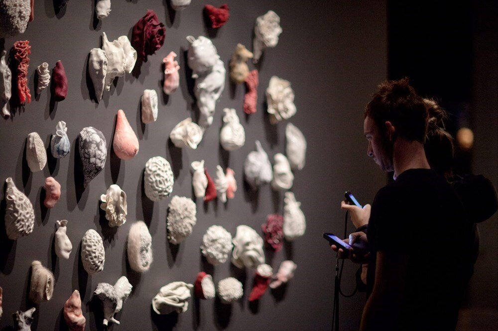
MONA is known for its many divisive curatorial choices. Described by Walsh as “a subversive adult Disneyland,” the museum’s collection—1,500 pieces in total, with around 200 works on display—centers around the themes of sex and death. Artworks such as a wall lined with over a hundred porcelain vulva casts and a machine that replicates the human digestive system to produce fecal matter reflect Walsh’s irreverent fascination with these themes and his desire to evoke a visceral reaction from visitors. Additionally, as the museum’s name suggests, the galleries juxtapose ancient and modern artwork from Walsh’s $100 million-dollar collection, but without any discernible order. Ancient Roman coins and Egyptian antiquities sit side-by-side with modern and contemporary works by artists such as Jenny Saville, Chris Ofili, Damien Hirst, and Andres Serrano.
Most notably, the dark, subterranean galleries at MONA are completely devoid of any wall texts, labels, or other traditional museum didactics. Instead, all visitors receive an audio guide known as the O, a modified iPod Touch device that combines indoor positioning technology with a content management system to provide information based on the user’s proximity to the works in the collection. Named after the circular home button on the iPod device, the O was the first mobile museum guide designed to replace traditional wall texts by making all content fully virtual.
As visitors wander through the museum’s labyrinthine galleries, the device (or app, for those who choose to download it on their iPhones) displays a list of the works nearby with an image and object label. Should the visitor wish to delve deeper into the work, they can read the irreverently titled “Art Wank,” a “short and pithy” curatorial essay that gives a traditional but accessible overview of the artwork. Many objects also offer additional content such as “Gonzo,” which are musings and rants recorded by Walsh about the work; “Media,” which are short audio files like interviews with the artist or curators; or “Ideas,” which provides “a set of provocations or talking points” such as quotes or statements to prompt discussions around the piece. Users can also rate artworks by choosing “love” or “hate” options, which Walsh has (perhaps jokingly) threatened to use to remove works that are “loved” by too many people.
Sample image and description using the O. Source: https://mona.net.au/museum/introduction
While Walsh is the main voice behind the O’s content, the technology was developed by a team he hired that eventually founded Art Processors, a design agency that works with cultural organizations to integrate technology with the visitor experience. Scott Brewer, one of the company’s co-founders, described how the concept for the O came out of Walsh’s frustration with MONA’s predecessor, the Moorilla Museum of Antiquities, which he founded in 1999 to house his collection. This was more like a standard museum, with white walls, glass cases, and explanatory texts that were often larger than the objects themselves. In Walsh’s words: “it looked great, but it also looked like every other museum in the world… I wondered: Why did I end up building the same museum as everybody else (Perrottet)?”
Unsatisfied with the traditional standards for curation and didactics in the museum, Walsh viewed the low levels of visitor engagement as a design issue that required a new approach. In 2007, after closing the museum for renovations, Walsh approached Brewer and his colleagues, Tony Holzner and Nic Whyte, to find a solution that would allow the artwork to be displayed in more innovative, aesthetically pleasing ways while still delivering rich content to capture audience interest, all without distracting the audience from engaging from the works. In essence, Walsh wanted to “both provide content and keep the museum free from anything other than the objects on display (Off the Wall).”
Finding the solution to Walsh’s problem took over three years due to the challenge of adapting existing indoor location systems to the size and specifications of MONA’s complex architecture. Alternative options such as QR codes and RFID wands were considered, but neither one satisfied Walsh’s desire to avoid distraction and ensure total immersion in the works. Although the initial version of the O relied on a third-party positioning system, Brewer says that in 2013, after the 5th generation iPod Touch was released with core Bluetooth capabilities included, the team was able to build their own indoor positioning system known as Enso Locate.
The location-based approach has also generated an unexpected benefit for visitor engagement. In addition to connecting users with digital content during the museum experience, visitors can save their path through the museum and access and share their visit through the museum’s website, thus extending the length of engagement with the institution. All the content on the O can be accessed online, but only after visiting the museum, enabling visitors to relive their journey and seek out works they may have missed.
According to Brewer, the O is used by roughly 97% of visitors to the museum, with 73% reporting that they used the O throughout their visit and 80% saying the guide enhanced their experience of the museum. Although the O is now available as an iOS app, Brewer credits having the devices in-house as a major factor in the high use rate of the O, and that the museum still carries enough iPods to provide one for every visitor since only 5% of visitors download the app onto their own device. “Removing that barrier for someone,” Brewer says, “that could be the difference between a 5 to 10% use rate and our 97% use rate.”
As a digital engagement tool, the O has been lauded for liberating the museum from the confines of tradition and “delivering vastly more information of greater richness than conventional signage (Flanagan).” As one of the earliest location-based mobile museum tour solutions, the O has been a major influence for other museums looking to adopt digital engagement tools, including the Cooper Hewitt well before it underwent its own digital transformation.
However, beyond the numbers, the museum and the team that created the O are still in the process of understanding and measuring the impact of the O on visitor engagement. Brewer says the feedback from surveys on the device’s ability to change the way the space is navigated and engaged with has been overwhelmingly positive, and that roughly 80 percent of respondents say they prefer the MONA experience to traditional museums and galleries. Although the museum’s success has far outstripped Walsh’s expectation, Brewer notes that “MONA didn’t exist before the O, so it doesn’t know a ‘pre-O’ version of itself to say that it’s learned more about the audience than what it had previously.”
Continue to part 2 here.
Resources
“Australian Millionaire’s Museum Tries Something New (And Old).” Hyperallergic, April 6, 2011. https://hyperallergic.com/22154/australia-mona-museum/.
Flanagan, Richard. “Tasmanian Devil,” The New Yorker, January 14, 2013. https://www.newyorker.com/magazine/2013/01/21/tasmanian-devil.
“Off the Wall – MONA: The O.” Art Processors. Accessed May 10, 2019. https://www.artprocessors.net/projects/mona/.
Perrottet, Tony. “Nudity, Art, Sex and Death – Tasmania Awaits You.” Smithsonian Magazine, May 2012. https://www.smithsonianmag.com/travel/nudity-art-sex-and-death-tasmania-awaits-you-62034501/.


