
Appealing to both visual and data-minded people is challenging. Infographics offer a great way to communicate a message about your organization using enriched graphics to accompany data and statistics. (Check out this post with impressive infographics from the National Arts Marketing Project.) In arts organizations, infographics make an excellent supplement to an annual report, and they can translate the value of donations for development. Previously this could be a challenging and time-consuming process, often requiring a graphic designer. Now, websites and web-based applications offer easy ways for anyone to create and customize infographics in a matter of minutes. Here are a couple of sites to consider:
Infogr.am is a web-based infographics application. Users can choose from six free themes offering different color, font and texture combinations. The infographic can be modified to add and change charts, text and pictures. Charts are created by uploading data from spreadsheets or by typing into a blank table. Additionally, you can insert maps, countdown clocks, tables, YouTube videos and photos. To rearrange the infographic, you simply click a feature, drag, and drop it in place.
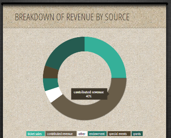
Pros: The program interface is easy to learn and use. The charts are one of the best features with options for everything from bar and pie graphs to progress meters and word clouds. Charts could be used to share budget breakdowns, convey the reach of programming or visualize fundraising progress. Each chart is interactive with animations allowing viewers to hover over pieces to see details of a graph or alternate between overlaying tables that may depict different years or programs.
Cons: You cannot adjust the text font or graphic size, nor can you add hyperlinks. One of the biggest downfalls is publishing your infographic. Infogr.am creates a customized link which brings viewers to the graphic on their website. With a free account, the link can only be shared on social media (Tumblr, Pinterest, Twitter, or Facebook). Pro accounts ($18 per month) offer four additional themes, the ability to download the infographic to your computer and the option to create private links.
Recommendations: This site would be best to make a quick infographic to share with social media followers. It’s easy to learn, intuitive to assemble, and provides valuable interactive features for online viewing.

Piktochart functions similarly to Infogr.am and offers many of the same features. After selecting a design theme, users can organize and arrange the infographic by inserting or updating charts, text, and images. This site offers nine free themes including a blank template along with several more customization options ranging from font style to background color. Chart data can be uploaded from your computer or copied into a table. Videos can be added from YouTube and photos can be inserted from your computer.

Pros: The wider range of design options is a definite benefit. Resizing features and being able to move them anywhere on the infographic allows users to organize their information as they wish. Additionally, this site has ability to insert hyperlinks so organizations can direct viewers to their website or fundraising page. Another significant benefit is the ability to download the image for free in addition to sharing a link on social media or embedding it on your website.
Cons: With the increased tools and features, it takes longer to become familiar with the program. Piktochart does not offer as many unique charts as Infogr.am, nor does it have interactive features. Moreover, the only way to remove the Piktochart watermark from the corner of your infographic is to upgrade to a Pro account ($29 per month). Pro accounts also have access to over 100 themes and many additional icon options. Educational and charity organizations can apply to upgrade to a Pro account for a reduced rate of $39.99 per year.
Recommendations: While it takes longer to create an infographic using Piktochart, the greater flexibility, allows users to customize formatting to match its other organizational documents, resulting in a more professional product that can enhance fundraising campaigns, add visuals to annual reports, and assist in presentations with stakeholders.