

Graphing is something that many people have had to do, whether it was in 9th grade algebra or on last year’s annual report. For some managers this is a simple task, but for others it is more difficult. Yet, humans are visual learners, so creating visualizations is as old as our scientific curiosity. The first data visualizations are thought to be humans recording celestial bodies [1]. Since then creating tools to explain mathematic and geographic information in a visual way has become a science that has degrees and fields of thought attached to it.
But where do the arts and non-profit professionals fit into this field of study? Most arts organizations have yet to hire someone who has specialized in data analysis or data science. However, with all of this depth of knowledge and theory behind conveying data visually, there is something that almost everyone can take advantage of if given the right opportunity. Online learning has become an accessible way to create that opportunity.
Online Platforms
Online learning platforms have progressed to a point that anyone, at any time, can gain as much of this knowledge as they need. These platforms can grant degrees from accredited universities or provide the most basic of information on data visualization. These options also can foster the kind of team atmosphere that many seek in a healthy and happy workplace.
As discussed in this AMT Lab article, online platforms create an easy way to offer professional development, which is key for retaining both millennial and gen X staff. Having the ability to access these tools on an as-needed basis, organizations can set-up their professional development opportunities on their schedule. If professional development is accessible, affordable, and flexible, then there is almost no excuse not to provide employees the chance to take advantage of these opportunities.
This type of professional development is smart not only because it retains staff and brings up staff productivity [2], but the skills acquired by staff can then improve the organization’s output. Annual reports, grants, staff meetings, and both internal and external documents take on a new life when the staff creating them is well-versed in data visualization.
Learning about data visualization takes on 2 forms: the theory behind what charts are selected and the actual manipulation of the data.
Learning the Theory
The theory behind displaying data is as significant as the theory behind music and is just as old. If someone was inclined to dive into the nuances, they could spend a lifetime studying.
For others, here are a few key points summarized from the Handbook of Data Visualization by Chen, Härdle, and Unwin [3]:
1. Construction: Keep it simple

Source: https://pixabay.com/en/chart-analytics-graph-bar-chart-1585605/
Charts and graphs have the complexity to describe data in many dimensions, which means that a lot of information can be packed into a small space. While this may make sense to the creator after spending hours to create a visualization, the audience only has a few minutes to digest what is put in front of them. There are many theories behind which colors to use and what shapes work best, so many theories, in fact, that there are PhD’s to be earned in data science and visualizations. But in simple terms, overly complicated dimensions, 3-D bars, colors that are similar, or lots of small font, all clutter and confuse a viewer.
A graph like the one above, is cluttered and the 3-D effect makes it so that the viewer cannot see clearly each of the bars. Make sure everything is clear, simple, and readable, but most of all make sure it tells a story. This doesn’t mean to manipulate the data (see #3), but it means that the creator must be able to find the important details from their data set and then highlight those details. This skill takes some time to master, so if someone is starting a course of study in data visualization and isn’t confident in this area, they should start with more theory-based courses. It will help them read data more critically and then they can progress onto other areas of study in data visualization.
2. Content: The images are only as good as the data and the interpretation of the data
This point is clear, if data is weak then the visualizations will suffer as well. Weak data means that it doesn’t represent the population being discussed, whether it’s too few people for a good sample size or it only describes one group of people within that audience. This is very common, but if an employee is unfamiliar with how to check for these pitfalls, it can be overlooked. This is the second step for someone learning how to visualize data.
In the same vein, if the data is good but the person interpreting the data is unsure of what they are doing, the analysis can focus on the wrong areas, leading to misinterpretations or incorrect stories being formed form the information that was collected. The best solution to this problem is having a few people, who are well versed in how to read data, who can act as a check and balance for misinterpretations, especially if one team member is just learning how to visualize data.
3. Context: Consistency is important
This is a question of clarity and honesty. Once skewed scales and inconsistent ranges on the axes of charts and graphs are pointed out to someone, it’s hard not to see how pervasive this is in the media at large. By keeping axes consistently numbered, starting at 0 if at all possible, and keeping ranges the same size, visualizations give the viewer the ability to accurately compare the information presented to them.

For instance, if this graph [2] did not have each bar marked it would be extremely difficult to understand that the top line on each graph differs by 33 percentage points. Also, the colors do not help the reader understand more about the graphs nor do they help the reader make any comparisons between the graphs. If each graph had the same sized x-axis, and if the colors were consistent, then the reader could see the connection between retaining talent and career opportunities much more clearly.
When making visualizations, the aim isn’t to make the audience see what the creator wants, but to tell the true story of the data. Sometimes the data is influenced by external forces so certain outliers or strange occurrences need to be explained to fully understand a graph but covering up information by messing with scale is deceitful. To be convincing, the audience needs to see a full picture.
TRAINING:
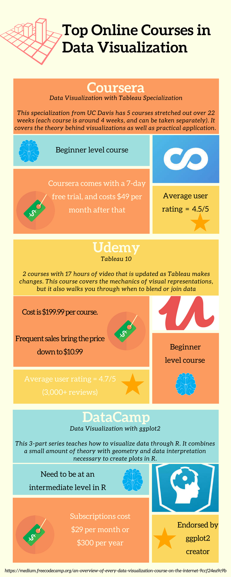
Source: Infographic created by author
From Theory to Practice:
The next step is learning which tools are available to produce these visualizations. There are some more familiar tools that can be used like Excel. However, programs like Tableau, are designed to give even more power to the designer with a user-friendly application. The best way to find the right tool for you is by taking a quick online course.
As covered before, online learning is a powerful tool for developing your workforce and maintaining early and mid-career staff members. Here are three online courses that are some of the highest rated on the internet.
Other online course providers are:
Lynda.com: they wide range of topics that focus on specific skill acquisition such as learning photoshop, learning to code or learning business strategies. It starts at $29/month, with a free trial month, and best of all it connects your acquired skills to LinkedIn.
Udacity.com: they have free courses and users can search by this as well as time limitations. All courses are in technology focused areas: software development, VR, AI, machine learning, digital marketing, and more. They offer what they call Nanodegrees, as well which are longer courses of study. Users can purchase classes separately, and most are around $300.
edX.org: This one is similar to Coursera in that they partner with accredited universities to bring course material and certifications to your door. It costs $29/month, but starts with a free class. There are courses in many different fields: 1600 courses from 100+ institutions.
CodeAcademy.com: This one requires a subscription ranging from $16 – 20/month depending on how long you commit. Users can learn to program, analyze data, website design and more.
Skillshare.com: This is a subscription-based learning platform as well. It is $15/month or $99/year. Topics are very broad ranging from creative & lifestyle classes to business & technology courses.
DataQuest.com: This site is a subscription service that charges $0 - $49 monthly for different levels of access to their courses and data. It’s focused on helping users develop skills as data analysts, engineers and scientists.
PluralSight.com: Courses here cover a wide area from IT to data to design and architecture. The courses begin in a subscription service at $29/month or less if you pay for the full year.
Whatever you decide to do, check with your business first if they have an account or would be willing to set one up. Most of these sites have an option to purchase as an individual or as a business. After all, this is how professional development has shifted and changed in this on demand world, and by encouraging employees to use these sites, they will be helping themselves.
References:
[1] Friendly, M. and D. J. Denis. “Pre-1600: Early maps and diagrams.” Milestones in the history of thematic cartography, statistical graphics, and data visualization. 2001. Accessed April 27, 2018. http://www.datavis.ca/milestones/index.php?group=pre-1600.
[2] “The-New-Path-Forward.” CEB. 2015. Accessed February 11, 2018. https://www.ldc.govt.nz/assets/The-new-path-forward.pdf.
[3] Chen, Chun-houh, Wolfgang Karl Härdle, and Antony Unwin. Handbook of Data Visualization. Germany: Springer, 2008.