

In Demonstrating Organizational Impact through Data Visualization, the discussion centered around the basics and benefits of the science behind data visualization and how it can help an arts organization. Now that a basic understanding of the psychology behind data visualization has been established, how can arts managers get started? This article will take the reader through the first steps to creating visualized data based on simple information an organization already collects. This will include exploring what data is required, the types of visuals that are available, and some online services that can help through the process.
Arts managers often have plenty of experience in excel and similar services creating basic charts and graphs. This article will move beyond these simple forms and explore more exciting and creative formats.
Input Data Required
One great aspect of data visualization is that it is open ended. The types of objects that are possible and the purpose that they serve are countless. Many business and research questions can be answered through the objects created. This is a perfect science for arts managers, as a creative mindset leads to better results.
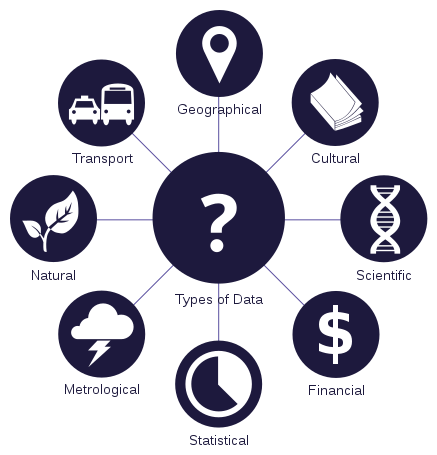
Source: https://commons.wikimedia.org/wiki/File:Data_types_-_en.svg
Arts organizations collect volumes of data: from basic organizational info to revenues, expenses, marketing activities, membership, attendance, endowment campaigns, and volunteer information. Many organizations collect this data with no current intent to utilize it. Although managers know that this data is valuable, the way in which it can be used is not immediately apparent. This data can be used to apply for new grants, demonstrate progress of a strategic plan, or convince a donor pool of a new program’s value. The best strategy is to first determine what questions need to be answered, then decide on a data set that can help answer that question. Let's use the following scenario with the following questions:
- Where do our audiences come from?
- What is the concentration of people coming from each area?
Visualizing this data will come in the form of a word cloud. Before beginning this experiment, let’s examine some tools used to visualize data and some basic types that anyone can use.
Word Clouds: The First Data Visualization Experiment
One free service for creating word clouds is Wordle. This service is incredibly simple and provides a perfect platform for a first foray into data visualization. This software operates off of basic text data provided and generates a graph known as a word cloud. Word clouds can be used to illustrate a number of metrics regarding words and phrases and displays them, either in a special color or size, depending upon their frequency of use within the given text.
Wordle is data visualization in its simplest form. It's as basic as pasting in text data into the box provided on their website. Below, I have generated a word cloud based off of all of the words I have used in this article up to this point. For a first experiment, I recommend generating a text list of all of the cities your organization's patrons came from to visit over a recent weekend. For another experiment, copy and paste the mission, vision and values of your organization into the text box on their website and see which words and phrases appear most. Ideally the concepts most important to the organization will show up with the greatest frequency, delineated by their larger size in the word cloud.
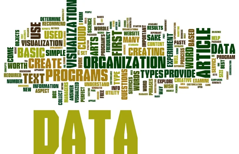
As you can see from my generated word cloud, the words in larger font are the ones that appear with the greatest frequency. (I’ve used the word “data” so much in this article it is dominating the image). This tool creates a powerful image of frequency and can easily provide information on patron zip codes or cities, illustrating the areas from which an organization draws the largest audiences. This information can than be leveraged by marketing and development teams.
This brief introduction to word clouds and data visualization structure should serve to alleviate any apprehension arts managers may have about the science of visualized data. In my next post I will sit down for a dialogue with Emma Slayton, CLIR Fellow for Data Visualization at Carnegie Mellon University. Emma will share her insights and expertise on how this science can be applied to arts organizations and the methodology behind it.
Has this post piqued your interest in Word Clouds? Share your results with us in the comments below!